3 Examples of Stylish Retail Design
Stylish retail design can transform your business. Here are 3 examples of stylish retail design that can showcase your products in the most effective way to build your brand and boost sales.
1. Stylish Retail Design – Clothing Store
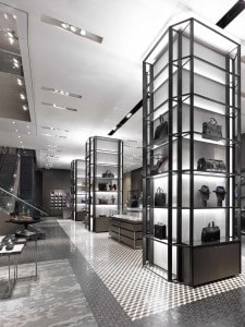
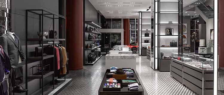
Holt Renfrew is a stylishly designed debut stand-alone retail store of over 16,000 square feet, located on Toronto’s fashionable Bloor Street. Holt Renfrew is a Canadian luxury retailer with a strongly masculine design resembling a private club as much as a store.
The retail design approach is quite innovative in terms of being a very contemporary and visually creative approach. With a strong sense of linearity and grid like design with a broad variety of display cabinets to ensure the retail design approach is stimulating.
There is a tower like approach for a set of display cabinets that extend the eye to the ceiling and create a proportional sense of size and scale, showcasing the products in a very enhanced way. The tower displays, offer a level of extensive presentation that is a nice mix of fine industrial structural feel but with a very luxurious finish.
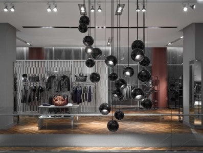
There are some creative installations in the retail design of the Holt Renfrew store. A noticeable installation piece is the lighting feature that almost works like a sculptural piece of Fine Art. The black bulbous lighting structure fills the space in an abstract layout design that is both creative and playful, defining space with a curvy dynamic feel to create a stylish retail design. The overall effect ties in harmoniously with the colour scheme and creates a feeling of unity with the variety of retail design features and displays.
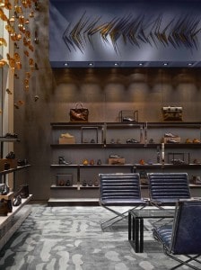
The colour scheme is a muted palette of greys, blacks, tan, rust red and lavender blue which creates a tranquil and subdued environment. This muted colour scheme showcases the products in complimentary way, whilst also allowing the products to stand out when they have a pop of colour. The lighting system is quite sultry, giving an very relaxed atmospheric tone steeped in luxury. On the display shelves each product has its own spot light which enhances its stand out visual impact and presentation, giving it an extra level of distinction.
The level of finish is of the highest standard, with a selection of luxury materials. There is quite a rich variety of stylish retail design in terms of the finish and material choices. A large range of diverse materials such as gray stained white oak and blackened stainless steel. A custom mosaic-tile floor connects leather goods, jewellery and men’s furnishings, while a hand-knotted custom carpet and deep blue leather upholstered polished stainless steel chairs define the footwear area. In the fashion clothing section there are walnut shutters and herringbone flooring create a residential feel, and a patterned wool runner marks a circulation path.
2. Stylish Retail Design – Supermarket
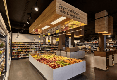
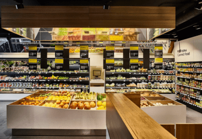
Colabeans wanted a very stylish retail design to complement the quality of their products and to create a wonderful retail experience for the customer. Colabean supermarket is located in Moscow, Russia, which is a very stylish retail design that combines supermarket functionality with stylish aesthetics to create a very enjoyable customer experience. The goal was to create a space, which feels clearly organized and cosy at the same time for the customers, from the moment of stepping into the store, until packing all the paid products into their bags.
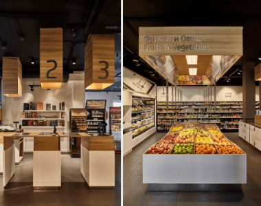
The first impression of the store is to display the fresh products as the first food item the customer sees. This way it sets the brand identity that Colabeans is a very healthy supermarket with only the freshest most colourful products available. The stylish retail design of the shelves and display cabinets have a strong flair of creative contemporary design. The curved dip on the display cabinet shows an extra effort towards design as a priority along with functionality.
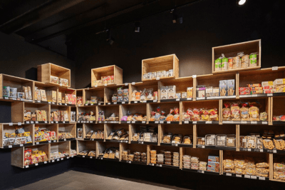
On the back wall there is a built in shelving unit that shows stylish retail design in how it stores and showcases the products. There is a nice grid like display that is reminiscent of traditional wooden boxes of food supplies, as if it is straight from a lovely country farm. The wooden box grid creates a nice charm that works quite well.
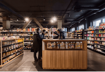
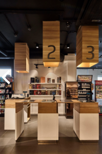
Overall there is a strong grid like design in the store that focuses on optimum space functionality for the customers path to purchase. Also there is a strong theme of wooden paneling and for stand alone cabinets and some overhead features such as at the fresh display area and at the tills.
The till area has a nice design consideration with wood paneling overhead, of hollow rectangular forms with internal lighting, that carry the same theme of wood and grocery boxes through to the checkout. The till counter possibly has a style of form over function as it appears to have limited space for accommodating a large amount of purchases. The design is more suited to processing shopping baskets.
The interior colour design of Colabeans supermarket is a palette of soft creamy white, natural oak wooden paneling, and a striking blacks on the shelves and on the ceiling. This combination of colours creates a distinctive look that helps showcase the products in an attractive and trendy way.
The other element of colour is the food products themselves, provide a vibrant selection of colour that is highlighted by the more neutral surroundings. Where the interior design stylishly showcases the products.
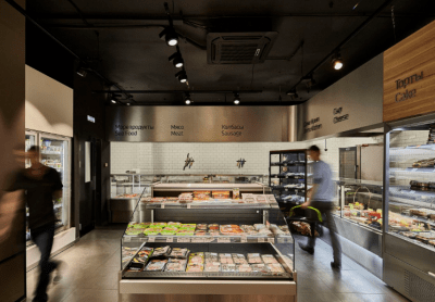
The meat and cheese counter area has a polished metal paneling, combined with sheer white tiles on the wall area. This choice of materials and design here promotes a strong sense of hygiene and cleanliness in such an important area when handling food.
Overall Colabeans is a modern and stylish retail design that showcases products in a trendy way to communicate high quality, fresh and trust worthy food.
3. Stylish Retail Design – Opticians
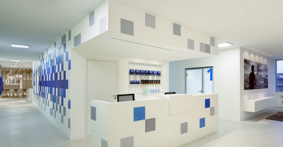
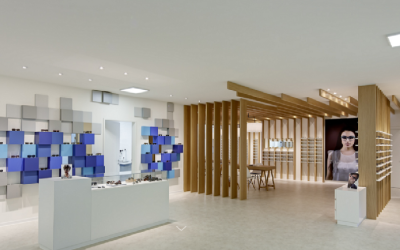
Optometrie Cagnolati is an opticians that is based in Duisburg, Germany. There is a dramatic pixelated wall in shades of blue and grey lacquered MDF finish, showcasing a range of eyewear in a 2,200 square ft retail space, along with a consulting and reception area. The sterile white evokes a sense of a clinical practice and the pixelated wall effect portrays the sense of the eyes function to denote colour and visuals.
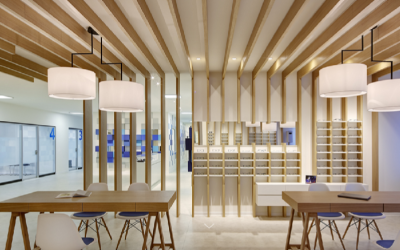
There is a combination of oak veneer features in the main store area of the retail space in the form of wooden beams that run the length of the room height and across the ceiling in a strong linear fashion. This creates an intriguing interior design effect of encasing this space as distinct from the rest of the premises, and defines the space as a point of focus. This point of focus invites the customer to go to this section and spend time there deciding what glasses to buy. It is a very inviting and stylish retail design.
There is also another style design to the retail space, with a walled pixelated feature where each colour pixel is a display shelf for a pair of glasses. This creates a nice variety from the enclosed wooden beamed section, and creates a sense of exploration for the customer in browsing both sections.
Overall a strong theme combined with a variety of materials that complement and create a strong experiential aesthetic that is both inviting and intriguing to customers is a strong step to building your brand and boosting your stores profits. These are just three examples of stylish retail design from around Europe that can be found here in Ireland also.
If you feel your retail store needs a redesign or makeover, or indeed you want to build one from scratch, get in contact with Storebest and we can help design the perfect retail space for you and your customers to help drive your business.

